An exercise in frustration: Getting product keys and support using the Microsoft Dynamics CustomerSource web site

“Microsoft Dynamics CustomerSource is an information-packed, password-protected site for customers who use Microsoft Dynamics products.” (Microsoft’s words, not mine.) I decided to use this information-packed, password-protected site to get my recently purchased product keys for Dynamics CRM 2011.

Below is a summary of my experience.

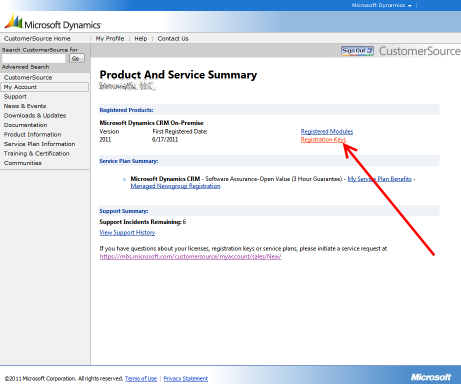
First, I go to the Product & Service summary page on the My Account page.

Then, I click on Registration Keys.

Then, I choose the appropriate version (2011) and upgrade option (No) and get the following message: “The keys you are trying are of Volume license, hence they will not be shown from MBS.” (I have no idea what MBS is.)

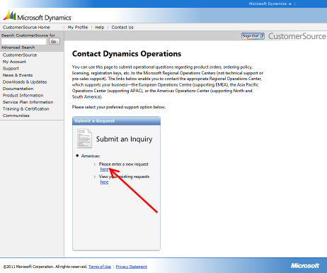
Frustrated, I try getting support by clicking the support link on the “Contact Dynamics Operations” page.

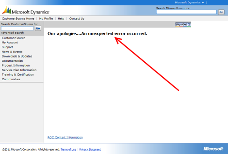
Which yields a very unhelpful support page that tells me, “Our apologies…An unexpected error occurred.” At least they are apologetic.

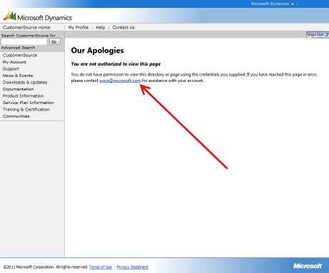
Despairingly, I click the ROC Contact Information at the bottom of the page (I have no idea what “ROC” is) and get a different apologetic error.

Pretty unimpressive, even for Microsoft.

Usability tip: Implement web page titles as inverted breadcrumbs

In the past, I implemented web page titles (i.e. the code in the <title> tag) the same way that one would implement a breadcrumb – that is, from the least-specific to most specific. For example:

Web Site Name: Category: Page Name

That is similar to how a breadcrumb would look:

Home > Category > Page Name

Note that I said this is how I did it “in the past.” Today, I read 9 Common Usability Mistakes In Web Design over at Smashing Magazine, which states in mistake #3:

Putting the name of the website last puts more emphasis on what the page itself is about, rather than on website branding, which is still there.

This makes perfect sense, and the article illustrates the idea well with screenshots.

Needless to say, I’ll be refactoring web projects to invert titles at my earliest convenience.

Outlining textbox input fields (and getting it to work in IE)

While using Google GMail today, I noticed that they put a blue highlighting around the text input boxes when they have input focus. It’s a nice touch that makes it just a bit easier for users to identify which field their typing in. (Safari users, of course, get this on all web sites out of the box.)

Getting this to work on your web site is a simple matter of applying some CSS styles. The trick is to give your normal inputs fields a 1px border and a 1px margin; then, when they have focus, give them a 2px border (with a different color if you so choose) and no margin. This will ensure the dimensions of the element don’t change when the border width changes.

The following CSS provides an example of styling text boxes (both text and password inputs, and multi-line text boxes) and select lists (single and multi-line) with an alternate outline when holding the input focus.

input[type=text], input[type=password], textarea, select {
border-top: solid 1px #8e8e8e;
border-right: solid 1px #d1d1d1;
border-left: solid 1px #d1d1d1;
border-bottom: solid 1px #e4e4e4;
margin: 1px;
padding: 2px;
}
input[type=text]:focus, input[type=password]:focus, textarea:focus, select:focus {
border-color: #4488cc;
border-style: solid;
border-width: 2px;
margin: 0;
}

Like many good web tricks, this’ll look great in Firefox but won’t do anything in Internet Explorer. That’s because IE (through version 7) doesn’t support attribute selectors (as in [type=text]) or the :focus selector. To get things to work in IE, we need to rely on a little more CSS and some JavaScript.

Continue reading

Is Verizon FiOS TV in your area? Don’t try checking online.

It seems I always have usability issues with Verizon‘s web sites. After checking to see if, after two weeks, they figured out why an old cell phone number of mine was still showing up on my online profile (they didn’t, it’s still there), I decided to see if FiOS TV was in my area.

They have a nifty Check Availability page where you enter your phone number (if an existing Verizon customer) or address to find out if you can get this service. Being a Verizon customer, I enter my phone number, click the “Can I get it” button, and wait…

While you wait, you do get a little graphic that is somewhat more useful than a spinning Ajax cursor.

image 

So, is FiOS TV available to me? Well, I don’t know. The response you get says nothing about FiOS TV — instead, it tells you about your FiOS internet service.

image

But wait, that isn’t what I asked! I wanted to know about FiOS TV! I am well aware that I already have FiOS Internet Service.

Alas, there’s apparently no easy way to find out online. Sometimes, you just can’t find what you’re looking for.

Unrelated but related — why did they spell it FiOS? Why the lower case “i”? Was FIOS ruled out for some reason? Or is it an acronym where only the F, O, and S dictate new words (perhaps Fi is for “Fiber”)?

According to Wikipedia’s FiOS article, “Verizon has cited the fact that “fios” is an Irish word for “knowledge.” If that’s the case, couldn’t they just make it FIOS? After all, it’s so hard to type FiOS… Maybe a marketing guru told them that the lower case “i” makes it “cool, hip, and Web 2.0.”

In any case, look elsewhere for your FiOS TV availability.

Verizon lets you debug your own form submissions

About a week ago, I had to contact Verizon to find out why a cell phone number I haven’t owned for three years was showing up on my online statement. In the process of the call, they reset my online account password, and now I can’t log in. (Hence the misuse of the phrase customer support.)

Today, I went to Verizon’s web site to reset my account information, where I was asked to provide my email address and phone number.

Clicking submit opened up Firebug! Thanks, Verizon, for letting me do your debugging work for you. Does this mean I’m on the payroll?

Verizon lets you debug using Firebug

Automatic downloads and usability

I just went to download the latest release of GraffitiCMS (which is rather impressive), when I noticed this on their download page.

Thanks for downloading Graffiti!

We know you’re excited about building your new Graffiti site, but please be patient as your download is being prepared. If you click the link below, you will experience a delay in processing.

If your download doesn’t start after you count to 10 backwards in Roman numerals, please click here.

First, I thought it was interesting that they said "If your download doesn’t start after you count to 10 backwards in Roman numerals, please click here." Then, I started wondering… is this the best way to deliver a download to users?

The "automatic download" is rather ubiquitous — nearly all web sites use it. Some questions I wonder about…

  • What percentage of users get the automatic download? How close to 100% is this number? If it’s far from 100%, should we rethink the approach?
  • For those who do get the automatic download, is it something they are comfortable with? Do they typically respond correctly to the browser’s response ("open/save" prompts, or those silly IE slide-in alert bars that people tend not to see)?
  • For those who don’t get the automatic download, how long does it take them to figure out how to initiate the download manually? What’s the abandon rate?

I don’t know the answer to any of those questions, but on the surface, I’d think a better approach (using the GraffitiCMS example above) would be to not have an automatic download. Instead, change the text of the page to the below, and have a big [START DOWNLOAD] button.

Your Graffiti download is ready!

We know you’re excited about building your new Graffiti site. Please click the Start Download link below to get your copy of Graffiti.

[START DOWNLOAD]

I wonder if an approach like that is more useful to users, and has a lower abandon rate than the automatic download approach…

Live search’s extra spaces (only for Firefox, of course)

Go to http://www.asp.net and do a search to see a nifty AJAXy popup search results box, powered by Live Search and including some advertising (which I deliberately grayed out below). Look closely, and you’ll see the URLs in the search results (circled in red) have spaces where spaces just shouldn’t be. No surprise, this happens Firefox but not in Internet Explorer.

About the only thing missing is a "Best viewed with Internet Explorer" logo, circa 1998. This really inspires me to click the "Get my own Search Box!" for my site — I’d just love this bug to be reflected in my own work, too.

image

Quicken, Windows, and WTF is happening?

I just installed Quicken 2008 for Windows, and ran it for the first time. Being a Quicken user before, when I got to the following dialog box, I clicked the [Next] button.

image 

It’s been eight minutes since I clicked the Next button, and aside from massive hard drive thrashing, nothing is happening. There are no other applications open on my computer, and virtually no utilization reported in Task Manager.

So, can someone please explain WTF Quicken and/or Windows are doing right now?

Ah, by the time I finished writing this blog post, I finally received the "Open Quicken File" dialog box. Based on the initial folder in the dialog box, Quicken looked through my entire hard drive to find a Quicken file. I know this, because the FolderShare trash folder is selected — hardly the expected default folder for Quicken.

Can someone explain to me what brain surgeon at Quicken decided that a feature such as this — with no progress indicator or cancel button — was a good one?